See your progress over time
One match is one data point. The Stats tab charts one metric across a window of matches and answers four questions in order: where is my normal, was this match typical, am I improving, and how do I compare. Each answer is a tap or two.
- 1
Find your normal
Open Stats, choose a category and metric — say Serve → 1st serve in — set the window to 10 and the view to MA. The flat line is your average over those matches. The blue band is your usual range: the middle 80% of where a normal match for you lands. It appears once five matches carry the metric.
- 2
Ask whether today was typical
Look at the last dot. Inside the band it was a normal day, even if it sits red below the average — change nothing. Outside the band it is notable, high or low: tap the dot to open that match, then look for the reason in the report (the opponent, the surface, one set, one situation).
- 3
Ask whether you are improving
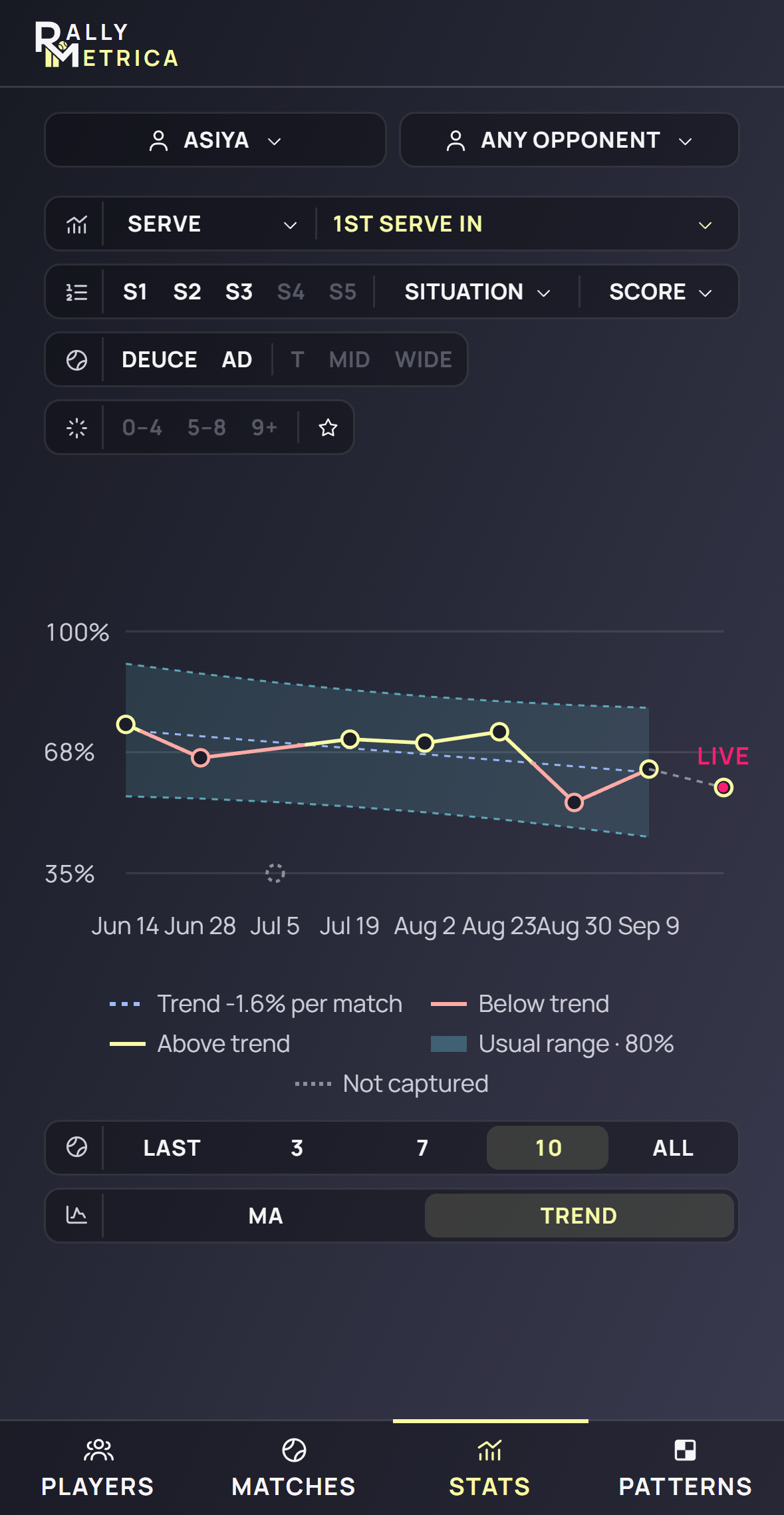
Switch to Trend. The legend states the slope — +0.4% per match — and the line is yellow where a match beat the trend, red where it fell short. Three matches in a row on the same side of the average say the level has moved; the slope says how fast. A flat trend with a wide band means the problem is consistency, not level. Use 7 or 10: three matches cannot show a trend.
- 4
Ask whether it improved where it matters
Put a cut on before you judge. Situation → Break point, or Score → 30–30, recomputes every match from those points only: 2nd serve points won under break point across ten matches is the honest test of the second serve you have been practising. A dotted gap is a match with no such points, not a zero.
- 5
Compare with one opponent
Change Any opponent to a name. The window narrows to that head-to-head, and the same metric reads against that player only. Compare the average here with the average against anyone: if your first serve drops ten points against one rival, that is a tactical fact, not a bad day.
- 6
Coach: compare two students against the same opponent
On the Coach plan pick a player, a second player, and a common opponent. Both appear as series on one axis — same metric, same cut, same opponent. Read two things: who sits higher, and whose dots scatter less. The steadier player is often the one to trust on the big day; the higher, less steady one has the bigger upside and the clearer thing to work on.
- 7
Start from a profile
In Players → a player → Trends the same window applies. Tap any metric row to open its chart in Stats with the player already chosen.
Good to know
- The moving average needs two matches, the trend three, the usual range five.
- The usual range is a prediction band: it says where your next normal match should land, which is why one match outside it is worth a look and one inside it is not.
- A match in progress is drawn as the last, hollow point and left out of the average, the trend and the band until it finishes.
- A missing value means “not captured at that tracking level” or “no points under this cut”. It is never a zero.
- The reference page explains the band and the colours in full: Learn → The stats engine → Stats over time.
Keep exploring